How to Choose Color Temperature for Outdoor Architectural Lighting (2700K vs 3000K vs 4000K + RGBW)
For European façade and landscape projects, color temperature is never “just a preference.” It affects material rendering, perceived glare, heritage sensitivity, and the overall night-time identity of a building.
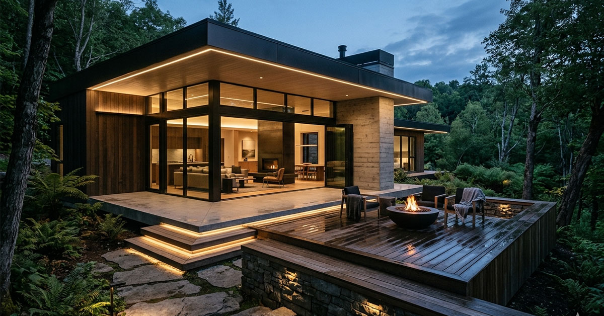
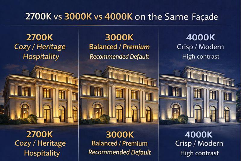
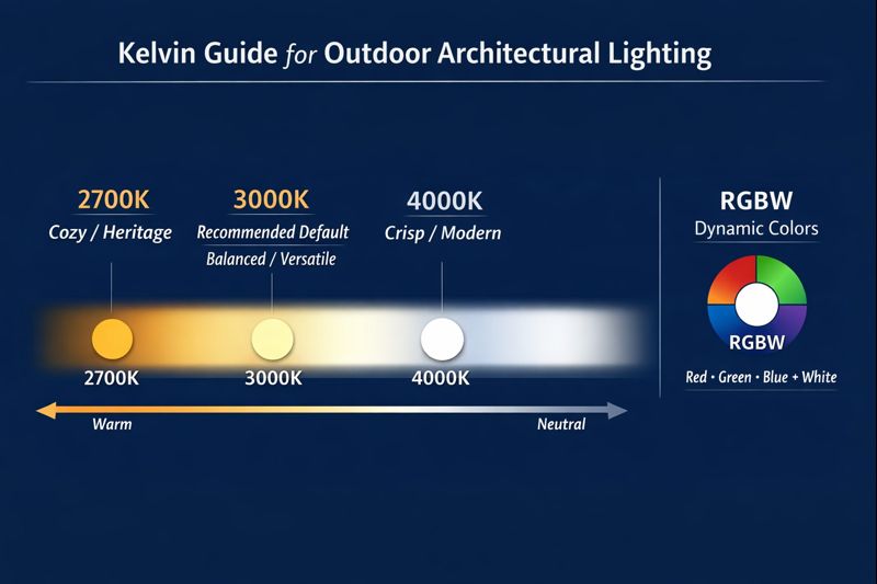
If you want one default CCT that works across most architectural styles and materials, 3000K is the most versatile choice—warm enough for comfort and heritage environments, yet clean enough for contemporary façades and commercial districts.
Why Color Temperature Matters in Real Projects
Outdoor lighting is viewed at different distances and angles—often from street level, across plazas, or from nearby buildings. Color temperature influences:
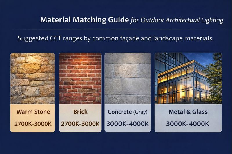
• Material appearance: stone, brick, concrete, metal, and greenery respond differently
• Visual comfort: warmer whites generally feel less harsh at pedestrian distance
• Perceived quality: consistent CCT across luminaires reads “designed,” not “installed”
• Night identity: the façade becomes part of a city’s evening atmosphere
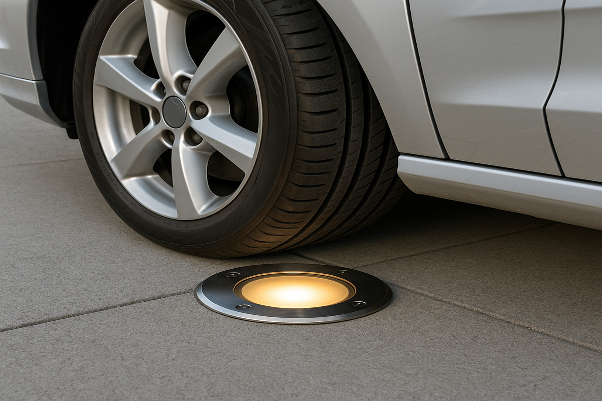
• Operational flexibility: whether one static scene is enough—or you need RGBW scenes
The Most Practical Recommendation: Make 3000K Your Default
If your goal is a premium, clean, and widely accepted architectural look, 3000K is the safest “default white” for European projects—especially when you have mixed materials (stone + glass + landscaping) and multiple fixture types (wall washers + grazers + in-ground uplights).
Why 3000K works so well
• Balanced warmth: inviting without looking “yellow”
• Strong material rendering for stone/brick while staying clean on concrete
• More forgiving in mixed installations (different optics, mounting heights, beam angles)
• Ideal for hospitality, mixed-use, and high-end residential—common European segments
Pro tip for contractors: When multiple suppliers or fixture families are involved, specifying 3000K + tight binning + consistent driver/control strategy reduces “patchy whites” on site.
2700K Warm White: Best for Heritage, Hospitality, and Intimate Spaces
Choose 2700K when the project needs a historic, candle-like warmth—especially for traditional façades, warmer stone, and intimate pedestrian environments.
Best fit
• Boutique hotels, restaurants, luxury residential entrances
• Heritage façades and historic districts
• Landscape accents where you want softness
Common risk
• On cool-toned materials (gray granite, metal, some renders), 2700K can appear too amber if overused.
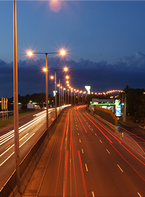
4000K Neutral White: Crisp Modern Definition (Use with Care)
Choose 4000K when you want a clean, high-contrast, contemporary look—often seen on modern glass/metal architecture or corporate campuses.
Best fit
• Modern commercial façades, glass & steel geometry
• Areas where clarity and “whiter” appearance are desired
• Feature lines and architectural edges with controlled optics
Common risk
• Can feel harsher at eye level if glare control and shielding aren’t handled well. In dense urban contexts, keep spill light and hotspots under control with proper aiming, cut-off, and accessories.
RGBW: When Dynamic Color Makes Sense (and When It Doesn’t)
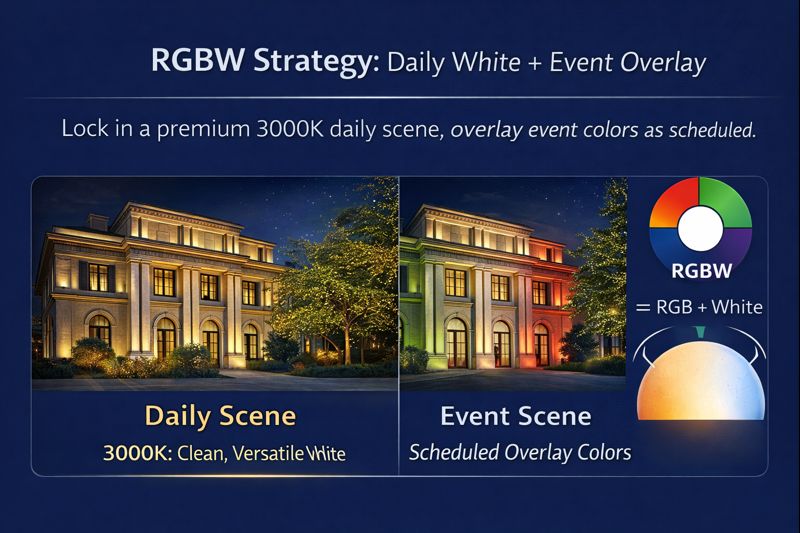
RGBW is ideal when the building needs brand identity, seasonal scenes, or event-based programming—but the best RGBW projects still rely on a strong daily white scene (typically 3000K) for 95% of nights.
Choose RGBW if you need:
• Seasonal shows (Christmas, festivals, city events)
• Brand colors for retail, mixed-use, corporate HQ
• Scene scheduling (weekday warm white, weekend color scenes)
• Landmark-style “media façade” moments (without becoming a screen)
Avoid RGBW if:
• The brief is purely heritage or “timeless”
• There’s no plan for controls, commissioning, and ongoing scene management
• The client expects “set and forget” simplicity
Best practice: Specify RGBW + a dedicated white channel so your “white mode” looks clean and professional, not a compromised RGB mix.
A Designer–Contractor Workflow to Select CCT (Fast, Reliable)
Step 1: Decide the night-time emotion
• Warm / heritage / hospitality → 2700K–3000K
• Clean modern / corporate → 3000K–4000K
• Brand / landmark / events → RGBW + daily 3000K
Step 2: Confirm materials + finishes (don’t guess)
Get actual façade samples or finish schedules. Two “gray concretes” can look completely different under the same CCT.
Step 3: Control glare first, then judge CCT
If you evaluate CCT using a fixture with poor shielding, you may blame the CCT for what is actually an optical problem.
Step 4: Keep whites consistent across fixture families
Mixing different “3000K” from multiple product lines can still look inconsistent. Specify:
• Tight color consistency (binning)
• A consistent dimming method and driver setup
• A commissioning check at target dim levels (CCT perception changes with brightness)
Recommended CCT by Applications
• Heritage façades & monuments: 2700K–3000K
• Hotels / hospitality / residential: 3000K (2700K for very warm concepts)
• Mixed-use buildings: 3000K
• Retail façades (premium): 3000K
• Corporate campuses / modern commercial: 3000K–4000K
• Urban landmarks with event requirements: RGBW + daily 3000K
FAQ
Is 3000K the best color temperature for outdoor architectural lighting?
For most mixed-material façade and landscape projects, yes. 3000K is the best balance of warmth, clarity, and wide acceptance—especially in European urban contexts.
Why not always use 4000K outdoors?
4000K can look excellent on modern architecture, but it often requires stricter glare control and careful aiming. In pedestrian areas, it may feel harsher if not controlled.
Why use RGBW instead of RGB?
RGBW provides a dedicated white channel, allowing a clean daily white scene—critical for professional architectural lighting outside of events.
If you want a reliable, premium, “designer-approved” default for European outdoor architectural lighting, specify 3000K—and only move warmer (2700K) or cooler (4000K) when the concept and materials clearly demand it. Use RGBW when you truly need dynamic scenes, but keep 3000K as your everyday foundation.